Fly UX - Flight booking
This project was assigned to me by the UX Design Institute as part of my professional diploma in UX Design.
Project
The goal was to design & build a prototype and wireframes for a conceptual startup airline called FLY UX, using design as a competitive advantage over much bigger airlines by delivering smooth and friction free flight booking experience to users which would be reflected in the success of the business and acquisition of new customers.
Focusing points: Flight booking process (How users can search for, find, and select flights).
The Process
I used a methodology of user-centred research and analysis to pinpoint the weakness and define the problem before creating any design.
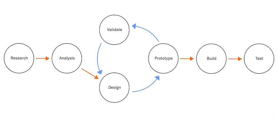
Research
Before any assumption made I wanted to start by researching to find out the core problem that users who want to book a flight online might face. The research techniques used were: Benchmarking, online survey, usability test and in-depth interview.
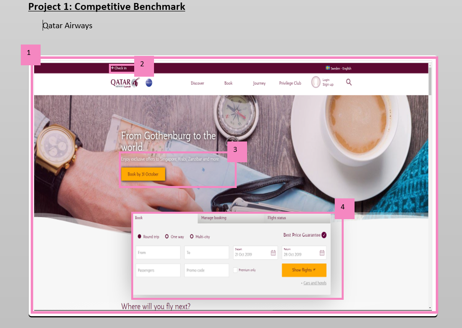
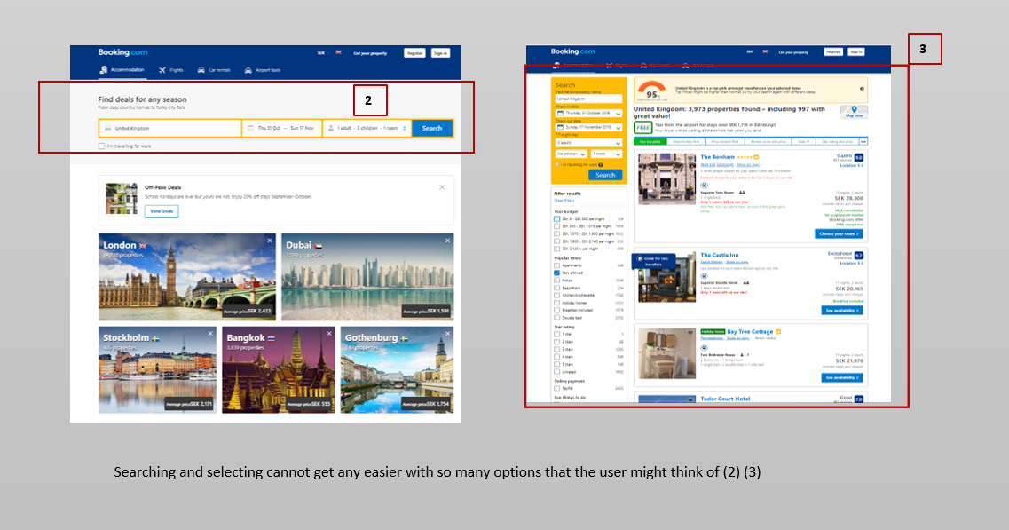
↳ Benchmark
I started my research with benchmarking. The goal was to understand how best-in-class websites solved their
problem related to flight booking process, understand the conventions needed to be followed, and highlight
best practices that I could emulate. I decided to go with: Qatar Airways, British Airways, Lufthansa, Virgin
Atlantic and an additional flight aggregator: Booking.com.
I reviewed those websites and took screen shots of each stage of their booking process and added comments
for each noteworthy step. By doing so, I was able to recognize a pattern. However, this was a "warm-up"! I
definitely had a lot more to do.
Benchmarking Analysis
Competitive Analysis
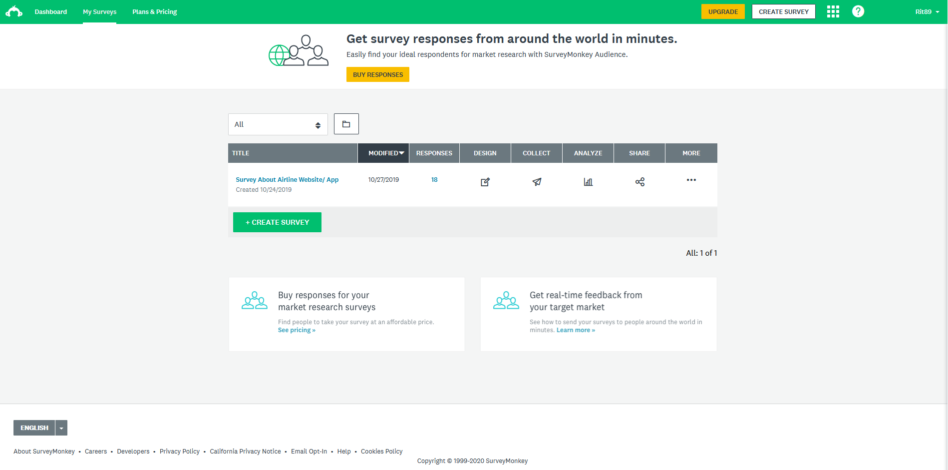
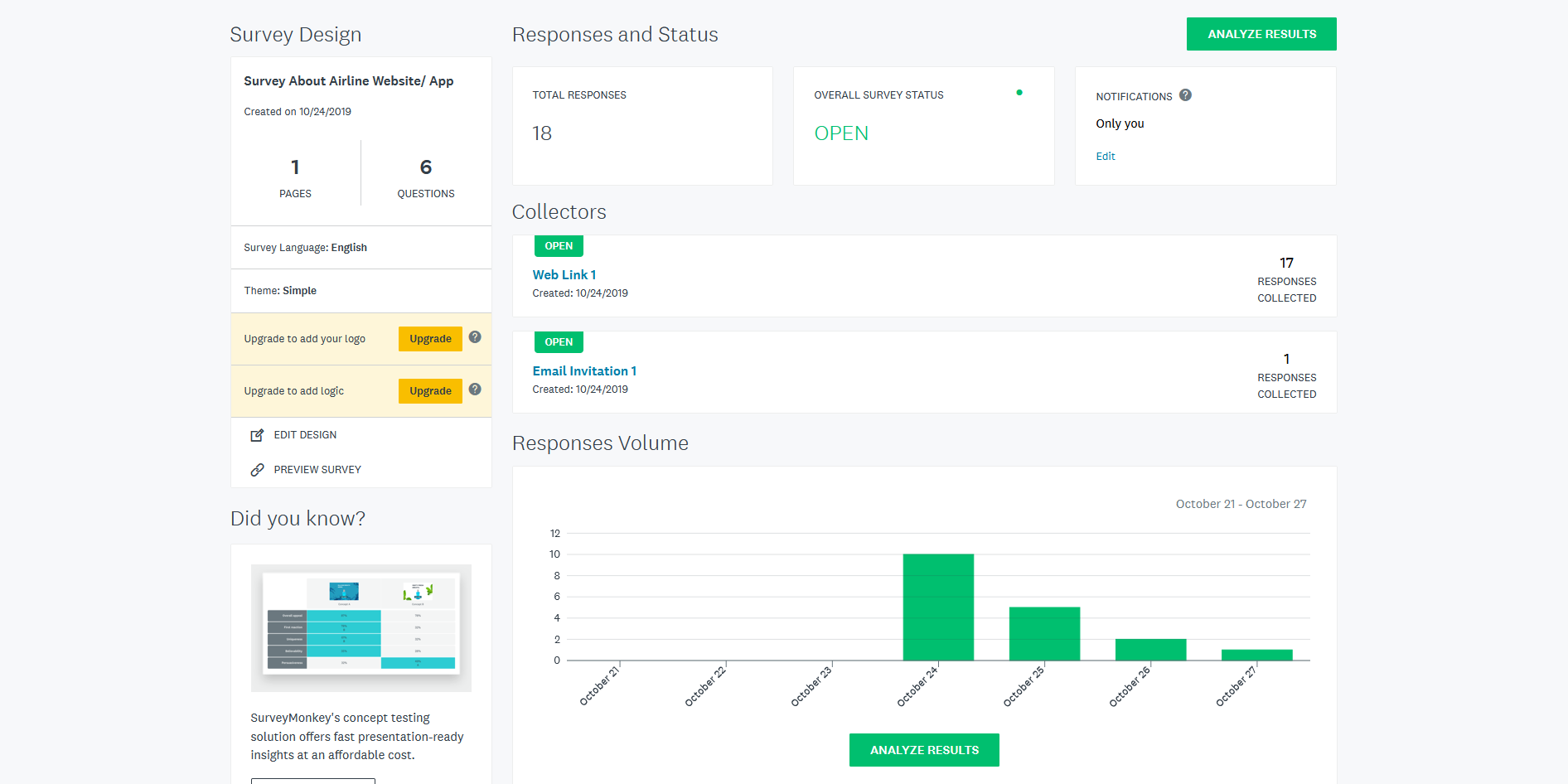
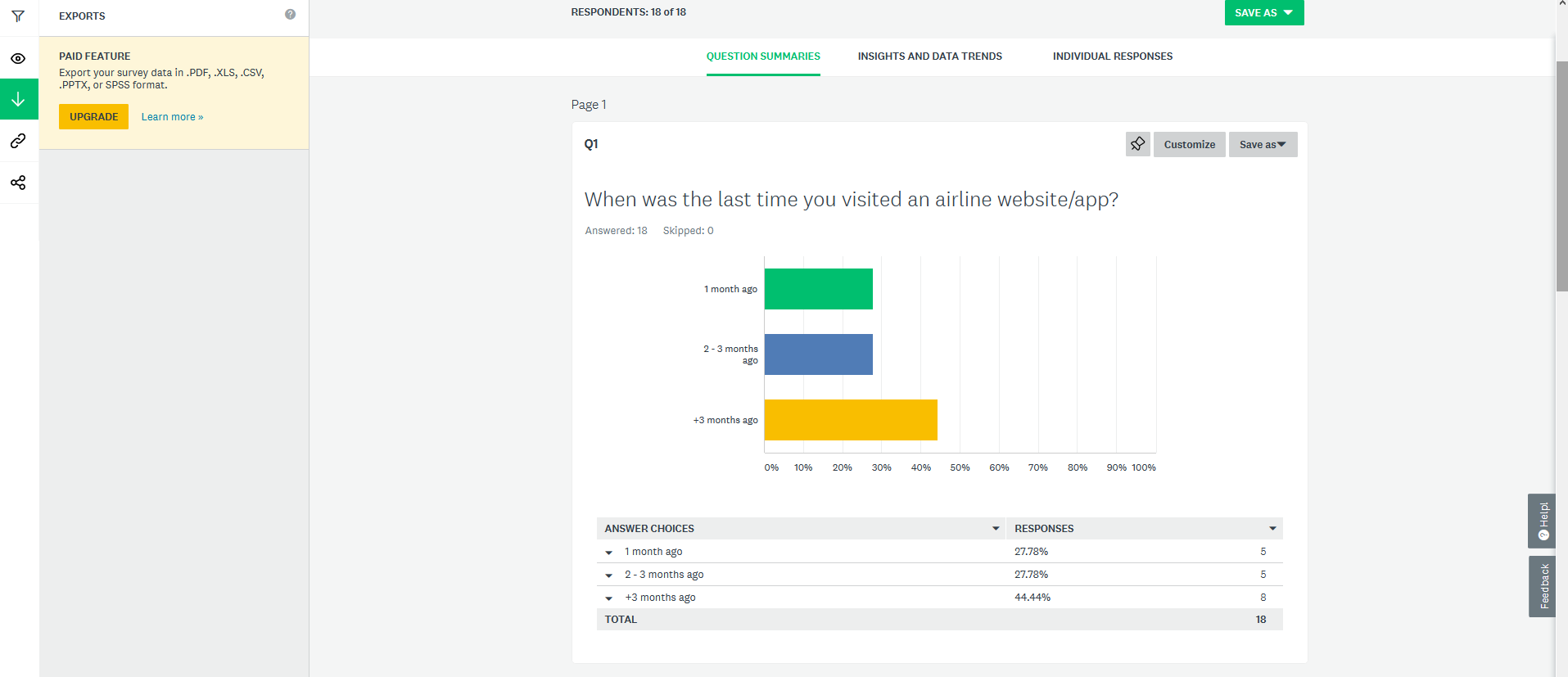
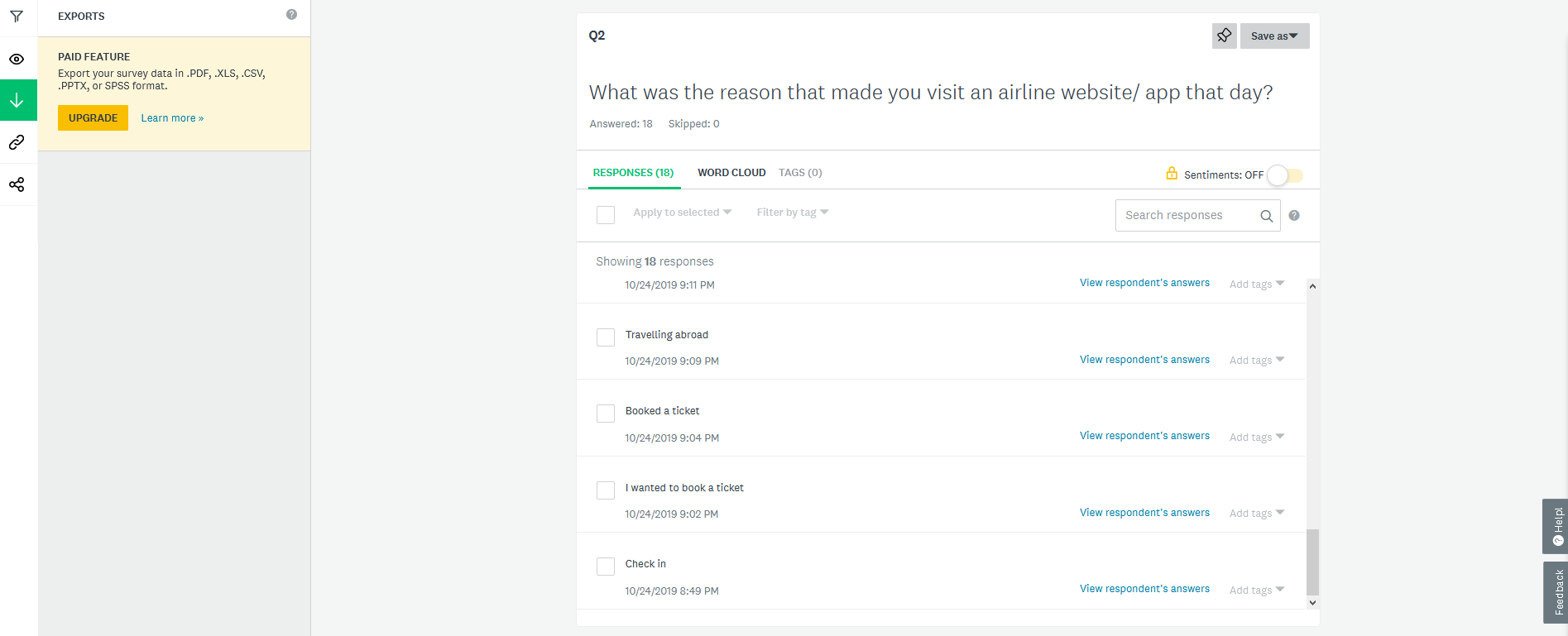
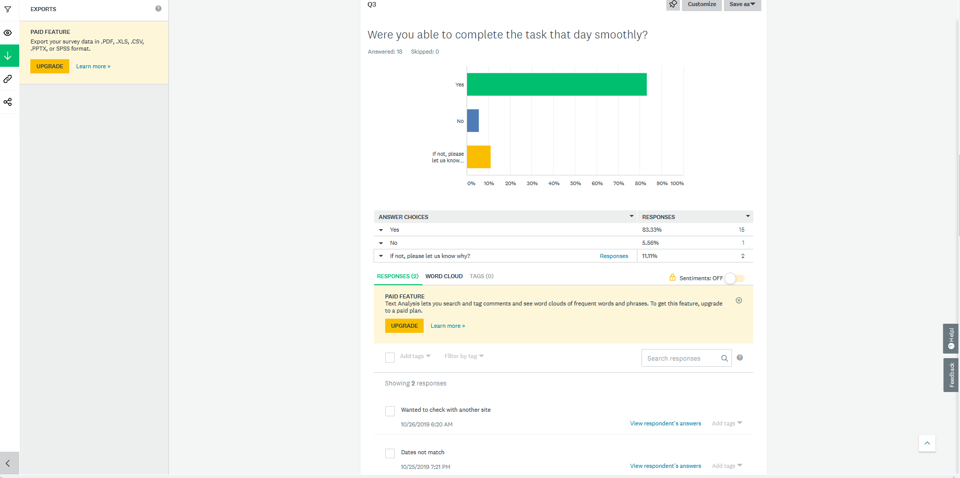
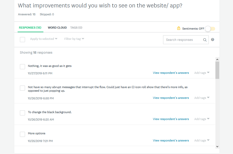
↳ Online Survey
Next, I created an online survey. The goal here was to learn more about the goals of people that use airline
websites and what are they trying to do, what is preventing them from doing it (if anything), what else
would they like to be able to do on airline websites.
From this survey I was able to have a bit more understanding of my potential users' goals, behaviours and
context.
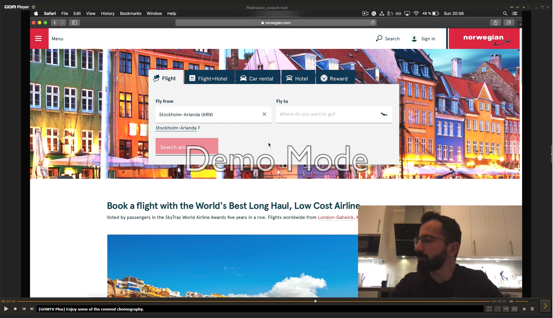
↳ Usability Test & In-Depth Interview
By now I had a pattern in mind for my website, however UX is not complete without usability testing so I conducted usability test combined with in-depth interview. To me, if you have a user or customer sitting in front of you, it's a good opportunity to dig deeper and learn more. Also, I decided to have a comparative test (asked the user to complete tasks on two different airline websites) to see how well or badly different organisations solve the same problem.
The purpose of conducting a usability test along with an in-depth interview was to learn more about the people that use airline websites, things such as: What are they trying to do? Who are they with? Where are they? What devices are they using?
As a result, I had full understanding about the goals, behaviours and context of airline customers when booking flights online.
Analysis
After the research phase was over, I was left with a pile of research data that needed to be analyzed and structured. The methods I used are: Affinity diagram and a customer journey map.
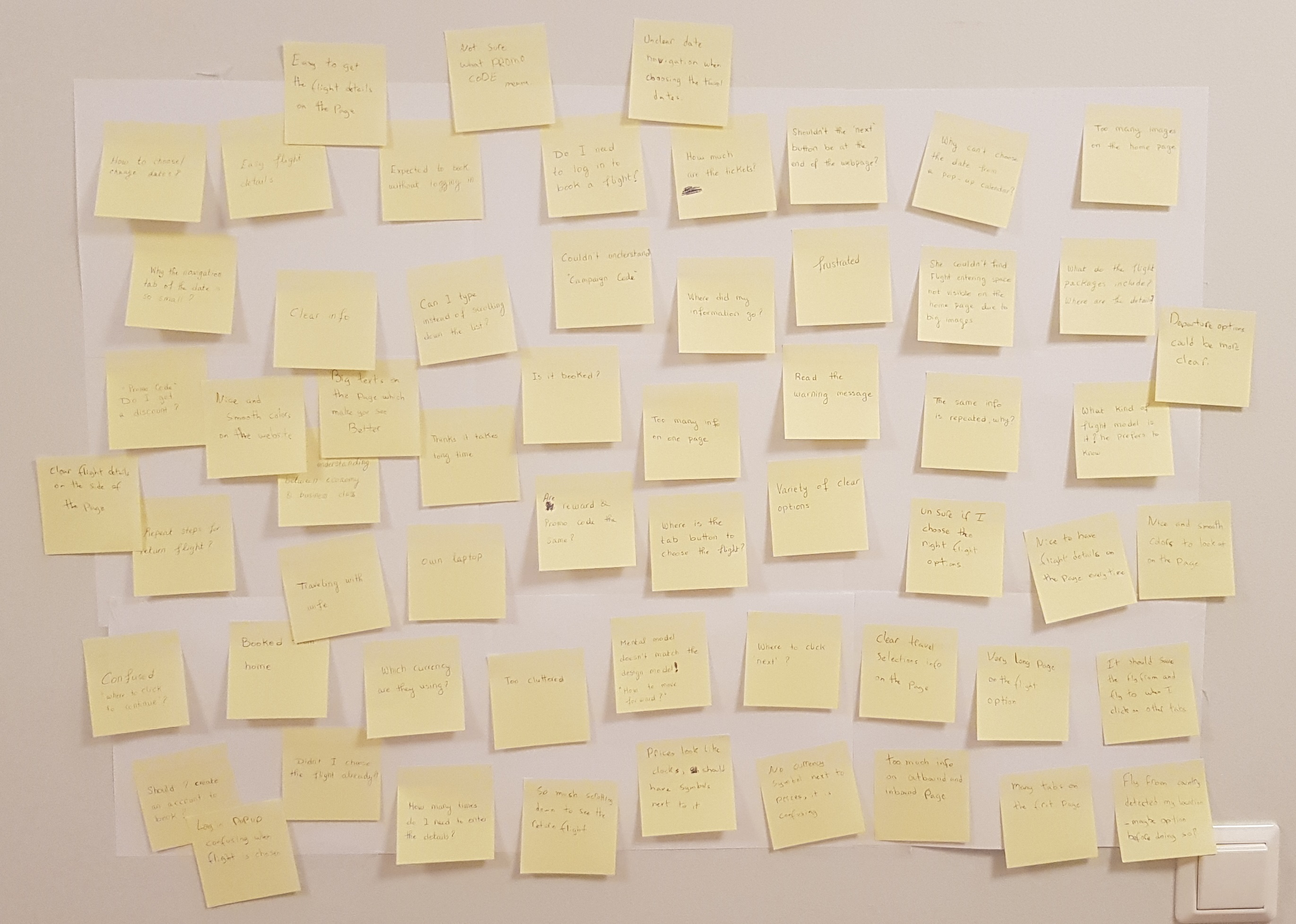
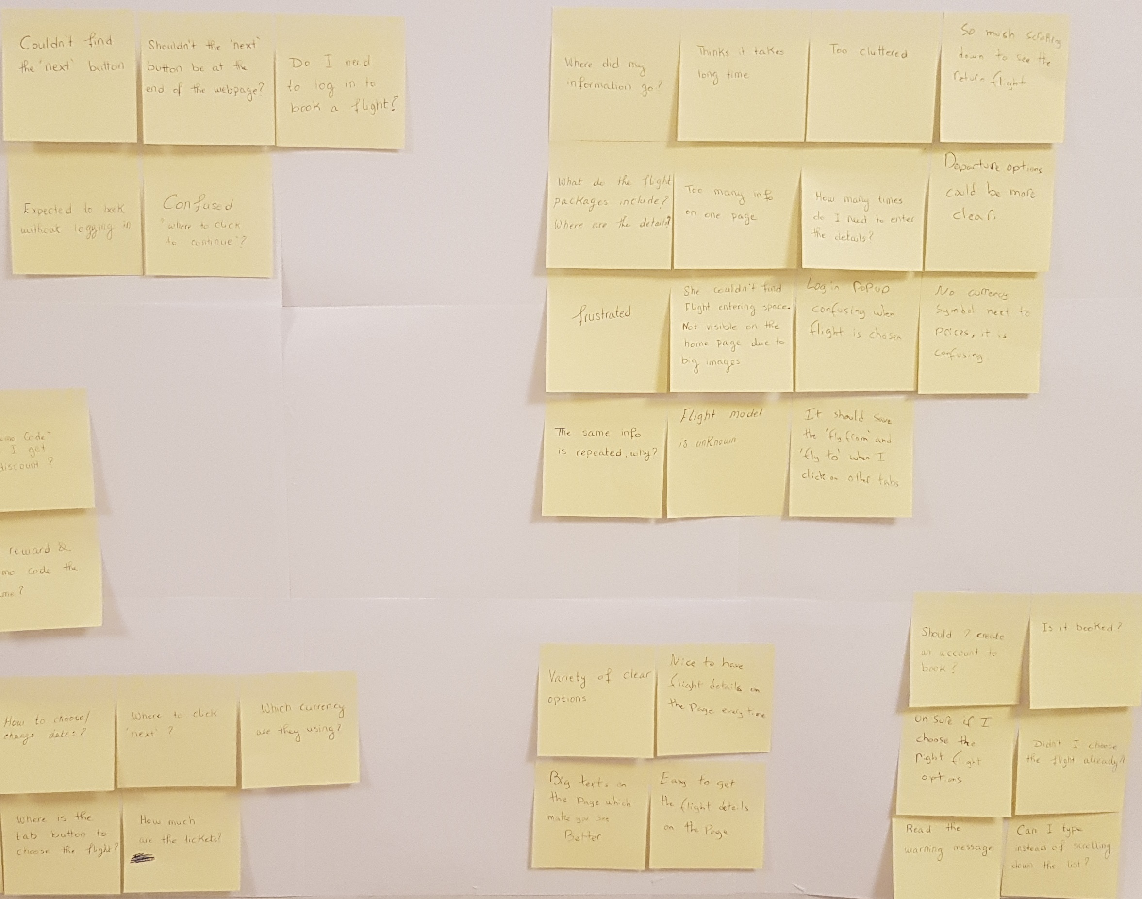
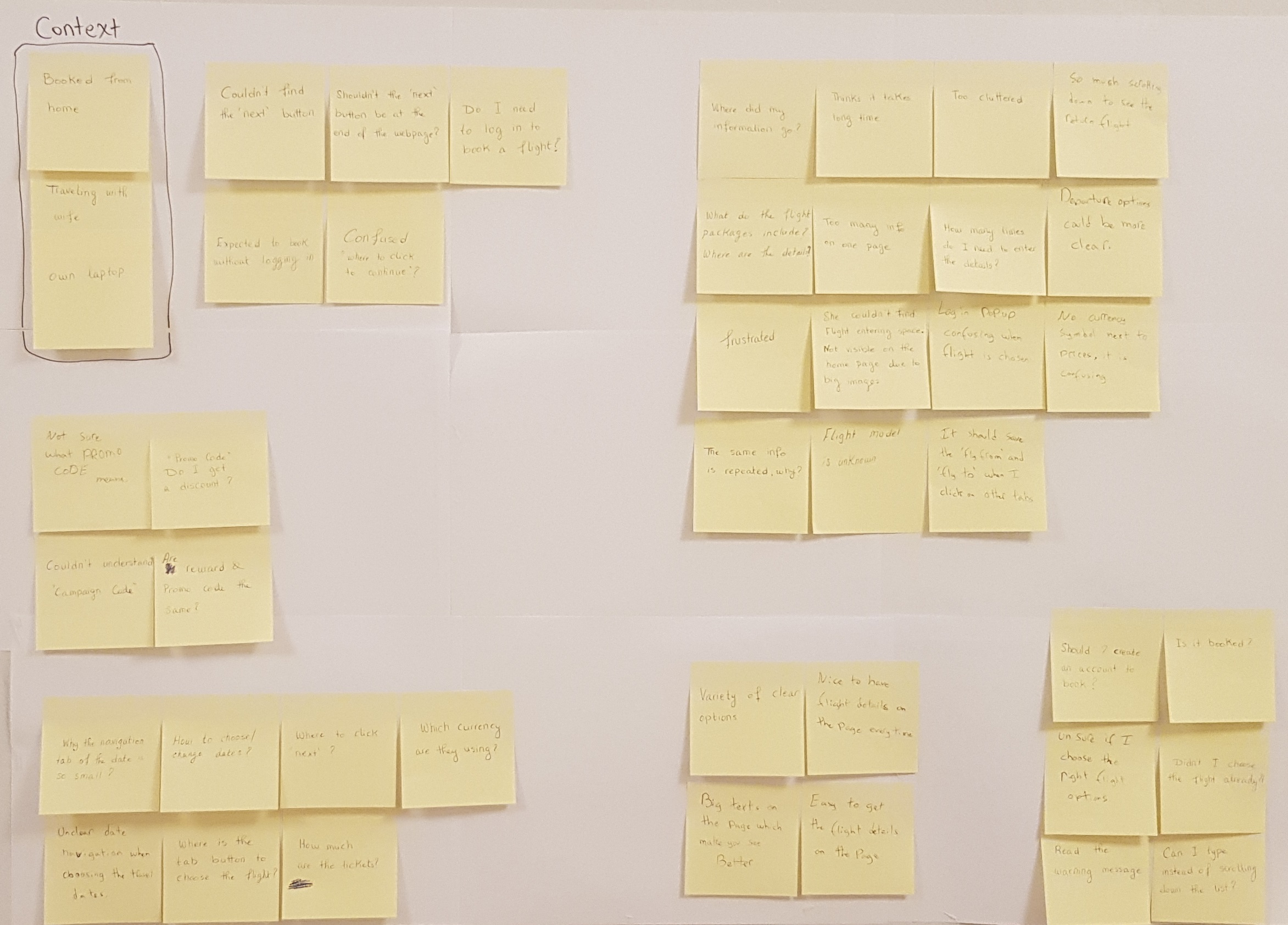
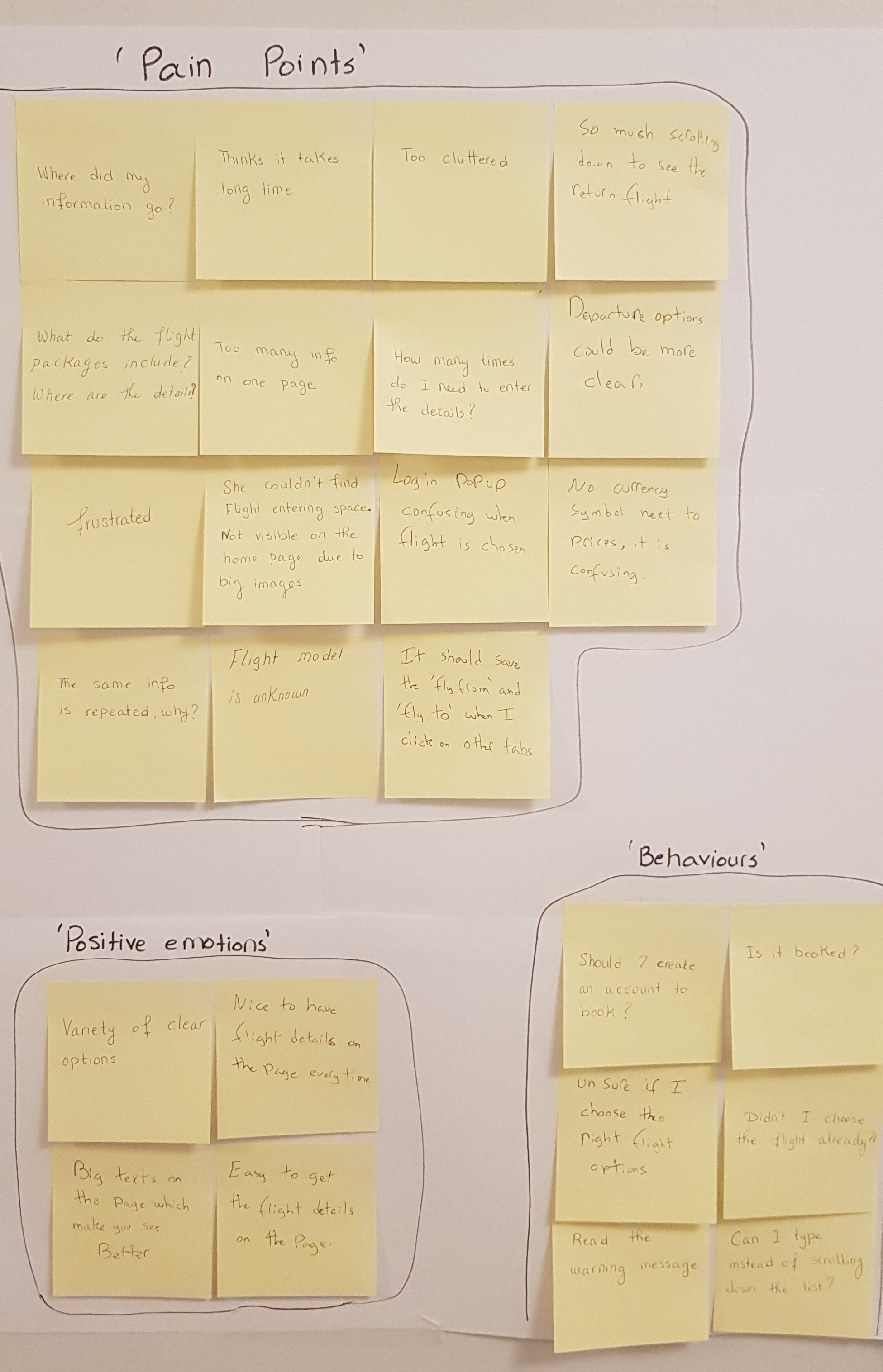
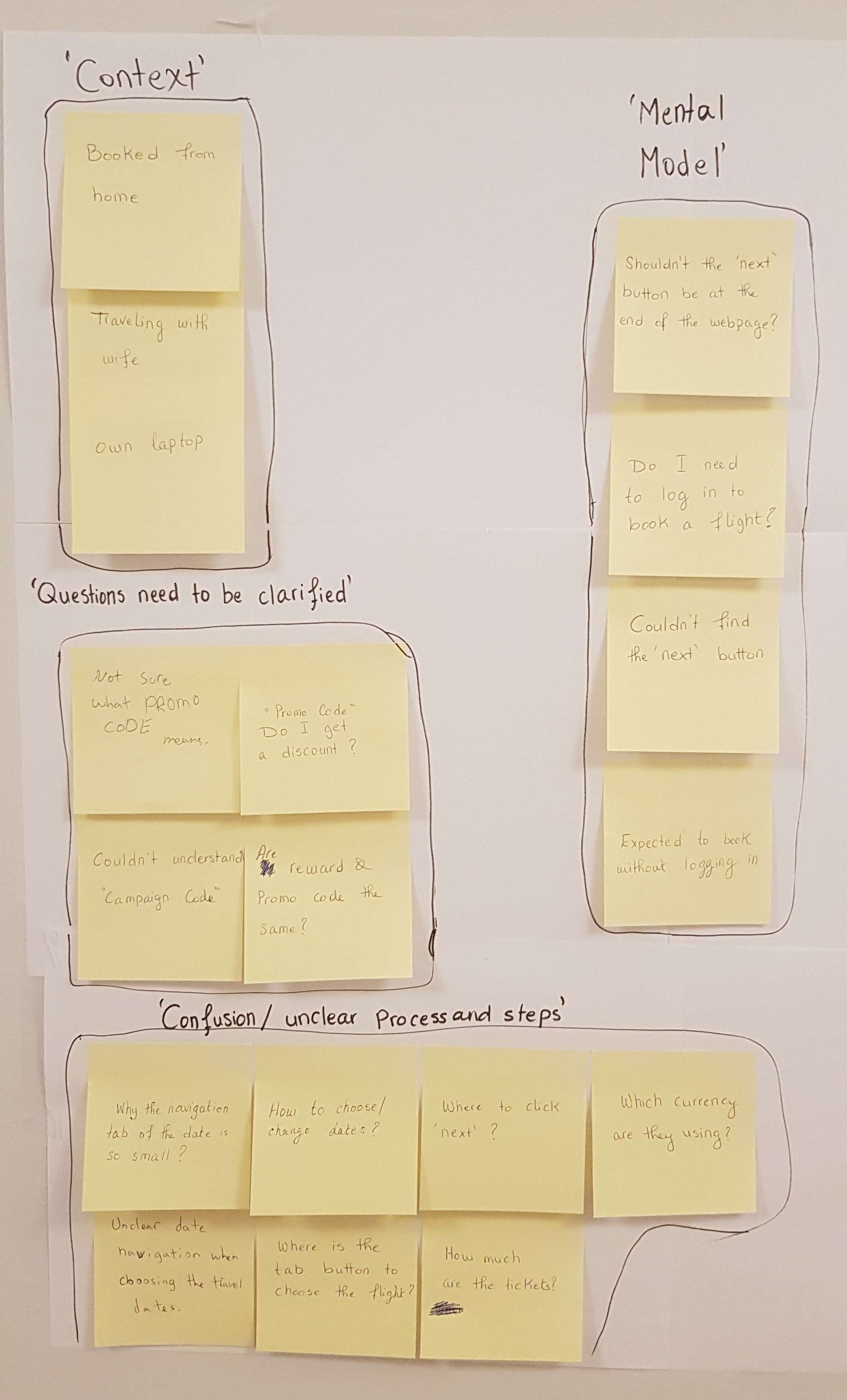
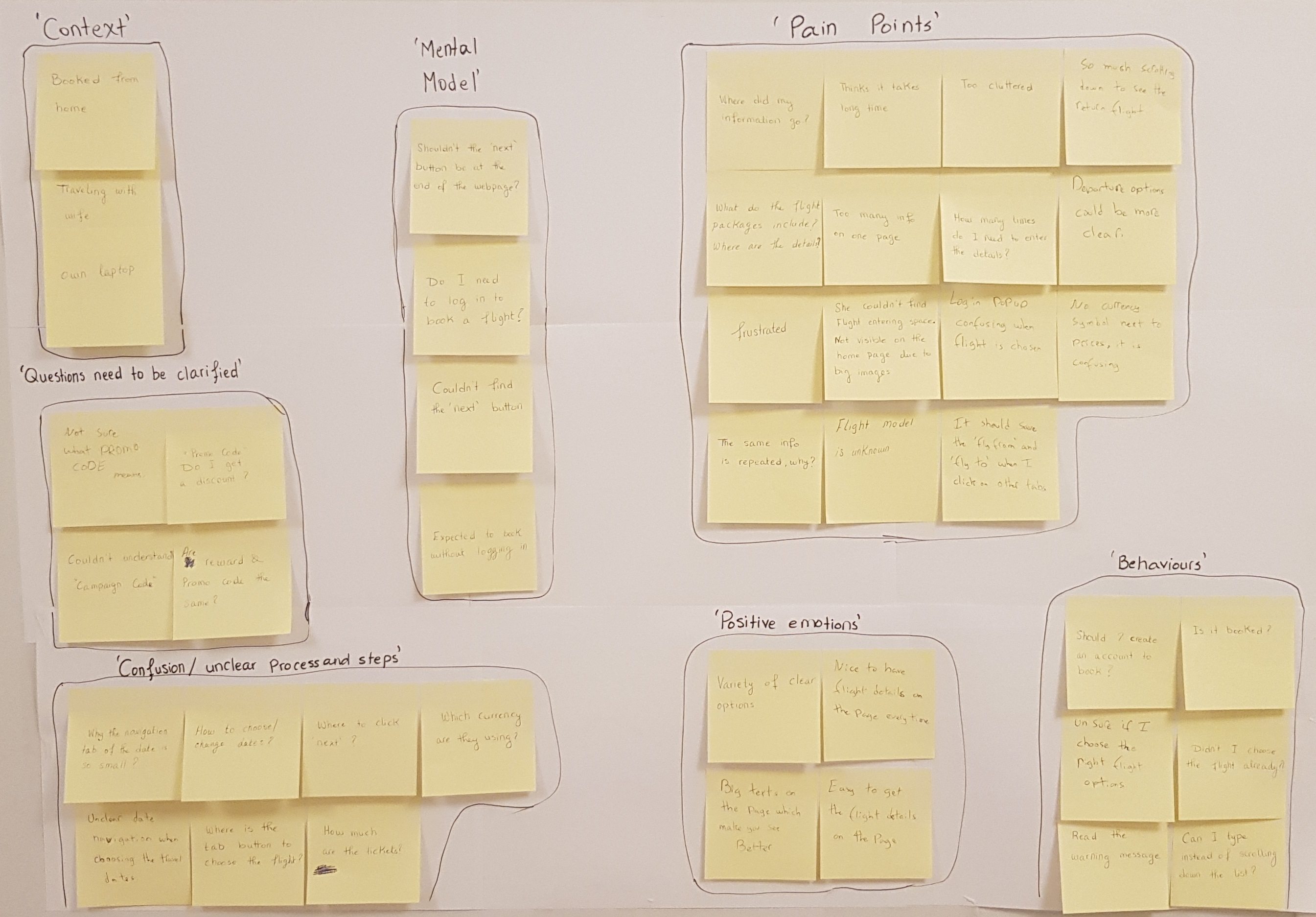
↳ Affinity Diagram
This method it is a great tool to organize huge raw data, it also helps in strengthening communication and
building a mutual understanding of the product you build. In order to do it I needed the help of an
additional person, so I "hired" a friend of mine to help me with this project.
We started by reviewing all the research I did prior to this step, we took lots of notes, wrote each
relevant comment we thought of on a post-it note and stuck it on the wall, focusing on the goals,
behaviours, pain points, mental models and contextual information. After several hours of squeezing our
brains out we reached to an end with a wall full of information. Then we gathered all the relevant
information together in a way that made sense to us, eventually we grouped them together and named them
accordingly.
↳ Customer Journey Map
My next step was to create a customer journey map to put even more structure on the analysis of my raw research data. Before designing the customer journey map using Sketch app, I drew the map using a paper and a pen until I was satisfied. CJM is a great tool to visualize what the customer experiences as they interact with a software or a website. This made me see things through the eyes of a customer. After this part of the project was over I had a highly structured output and a better understanding for designing my airline website.
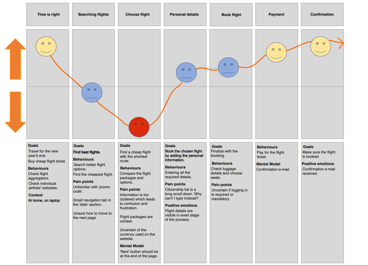
Digital Journey Map
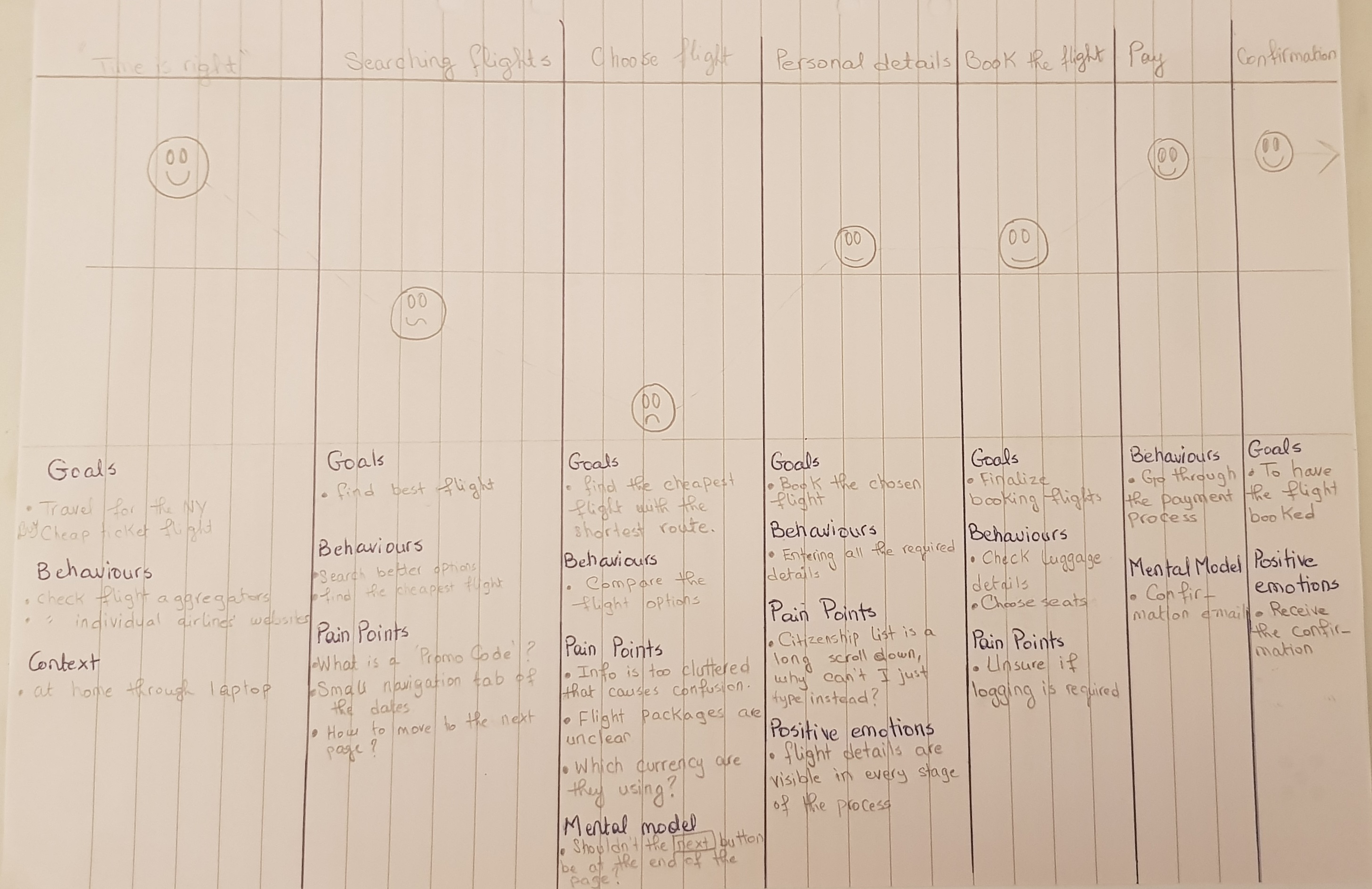
Journey Map Sketches
Design
With all of the data which I defined and analyzed it was time for me to start designing the airline website.
My overall objective was to fix all of the issues I had uncovered during my research and which were
highlighted on the customer journey map.
My designing techniques that I used are: Flow diagram, large amount of sketches, fidelity prototypes and
wireframes.
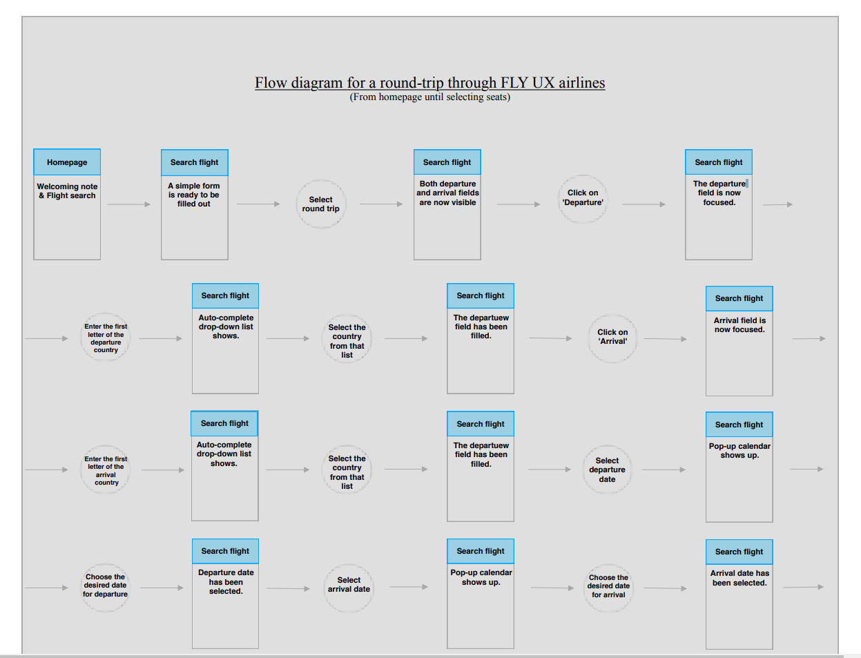
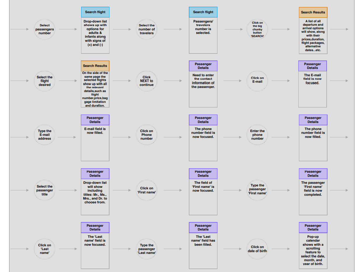
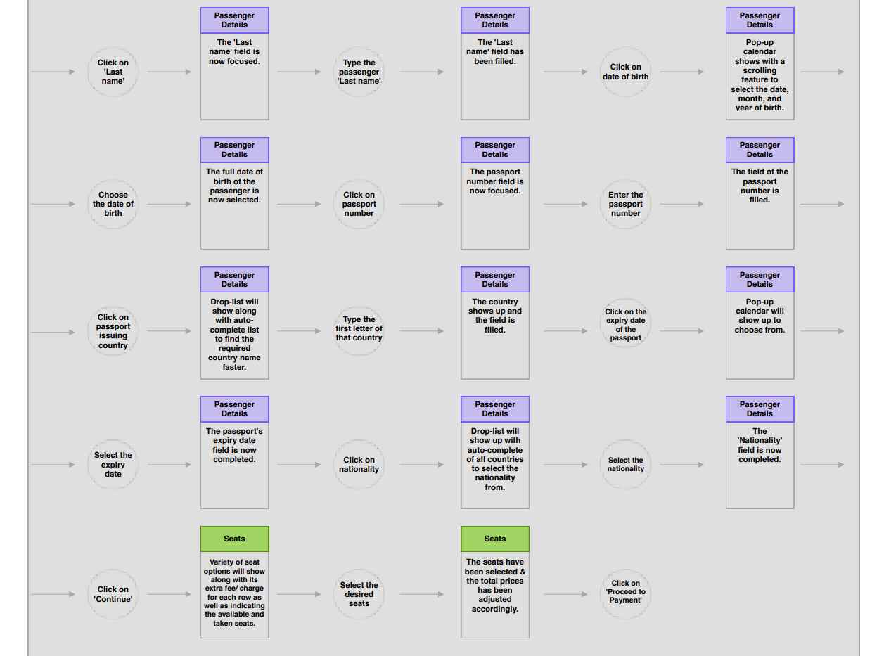
↳ Flow Diagram
The data which resulted from my research and analysis helped me to define the high level flow for booking flights on the new airline website. I started off by sketching the flow diagram on paper before compiling the final document on computer.
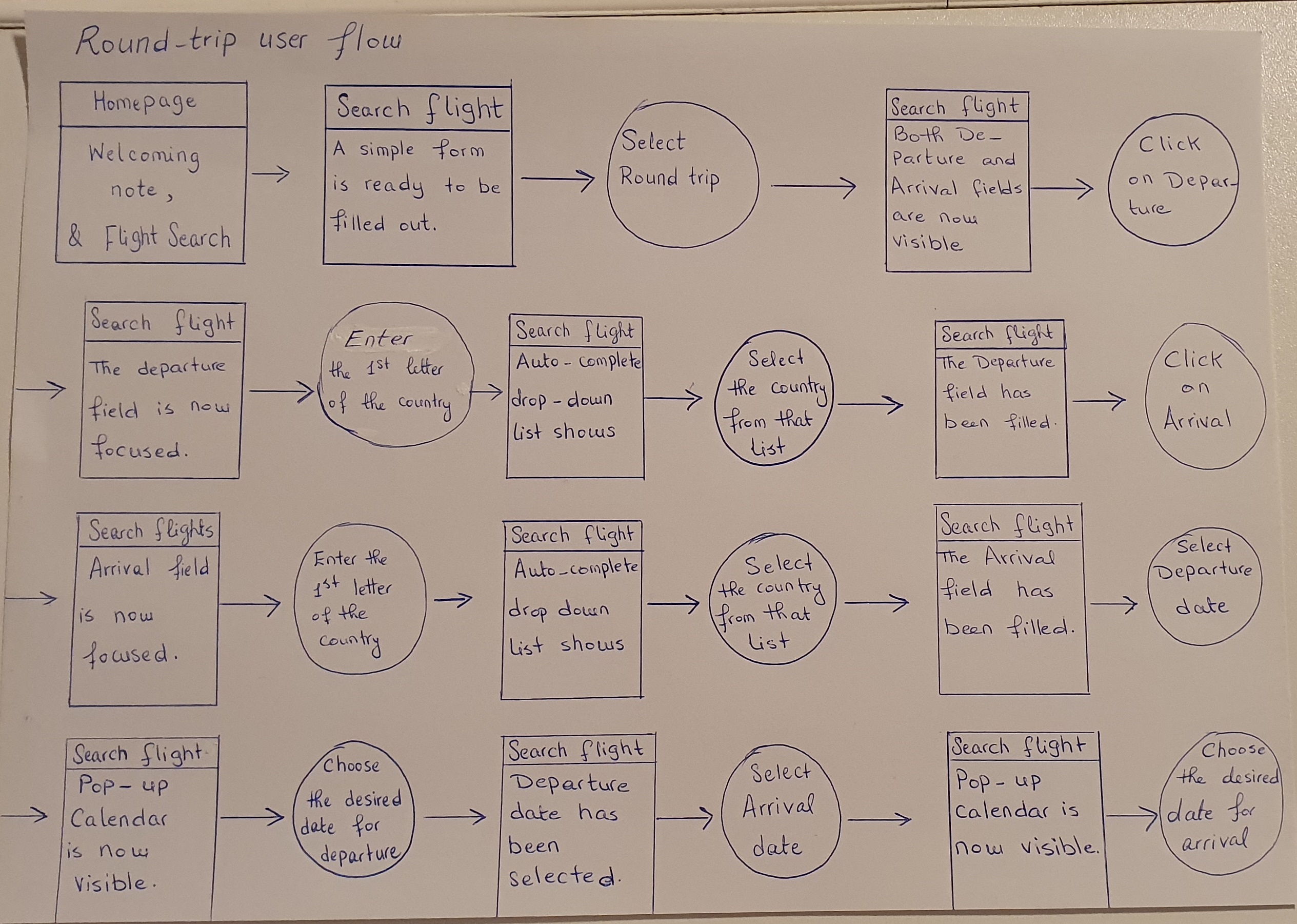
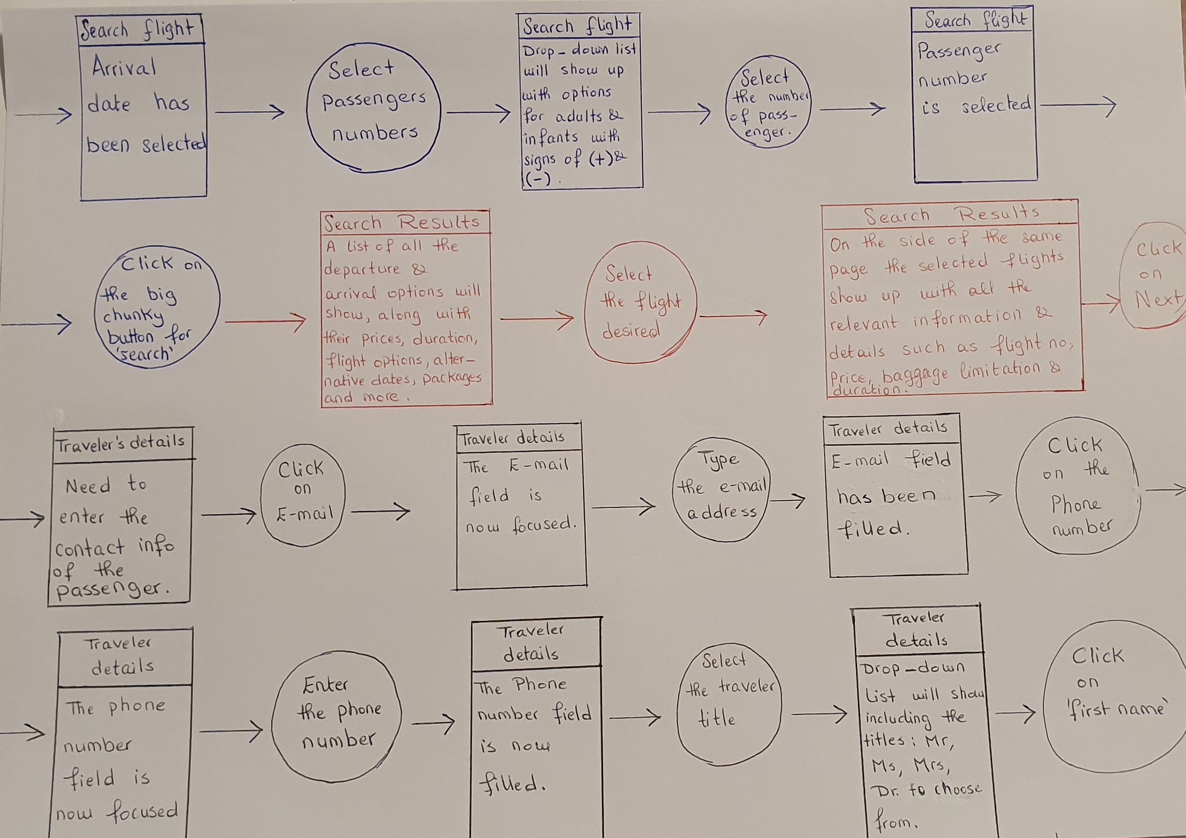
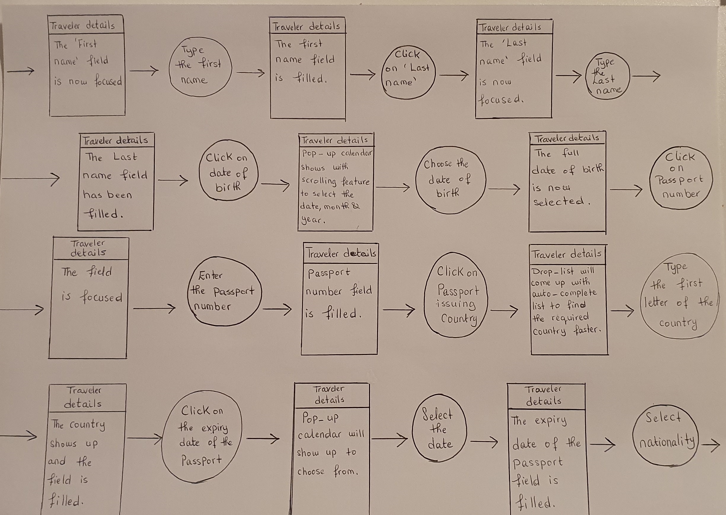
↳ Sketching
At this stage I had already defined the main flow and navigation, identified the key issues that needed to be addressed in journey maps and had plenty of ideas from benchmarking, so I felt confident in sketching the screens and screen states for users flowing through the flight booking website. I had multiple interations before the solution became apparent to me. Eventually I had four screens sketched covering the booking process from searching for a flight to booking a seat online.
.png)
.png)
.png)
.png)
.png)
Prototype
Using Sketch app I designed a medium fidelity prototype for the Fly UX flight booking process and then made it interactive using Invision. My goal was to design a prototype detailed enough to test the high level flow, screen layouts, text, and basic interactions.
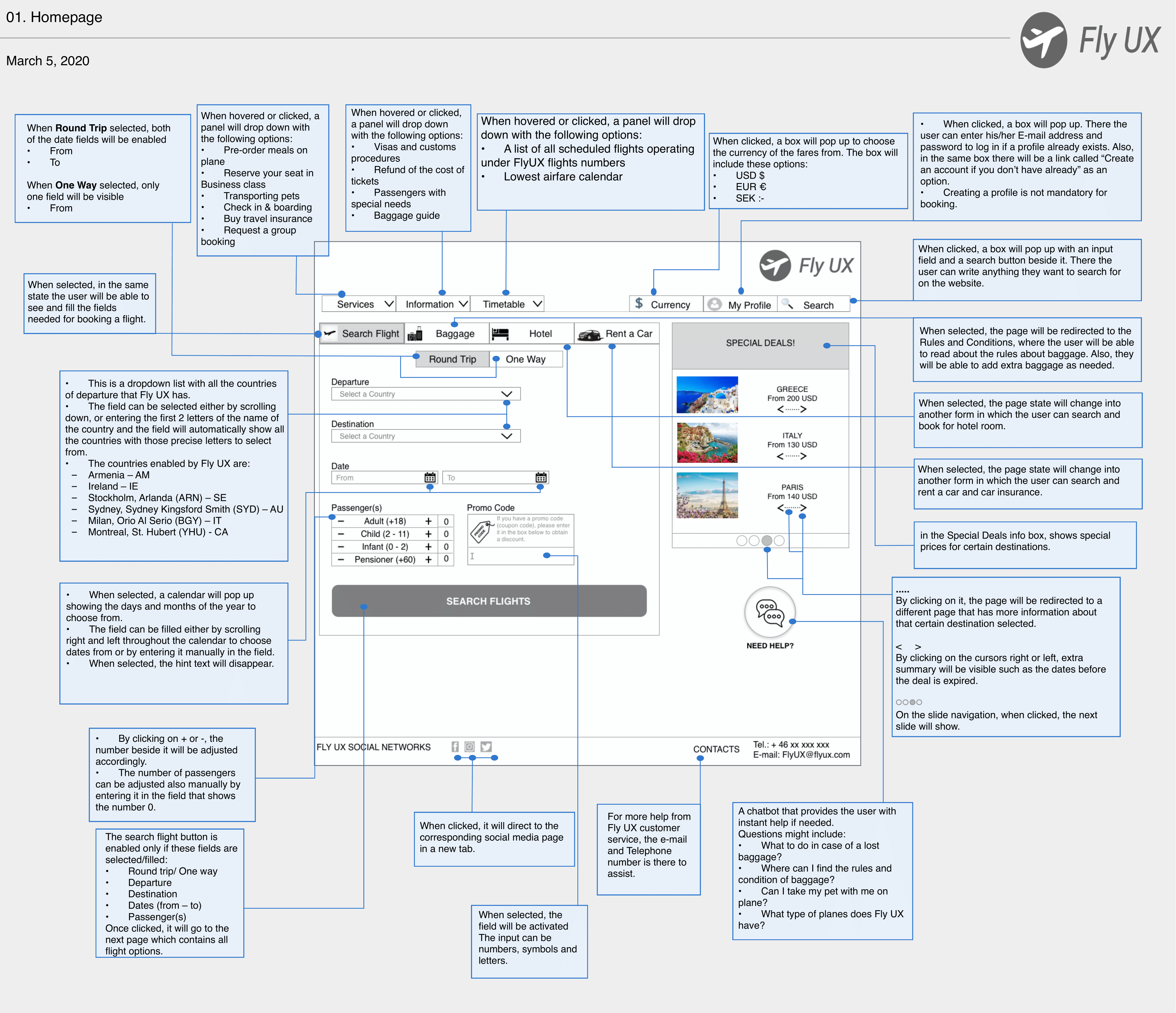
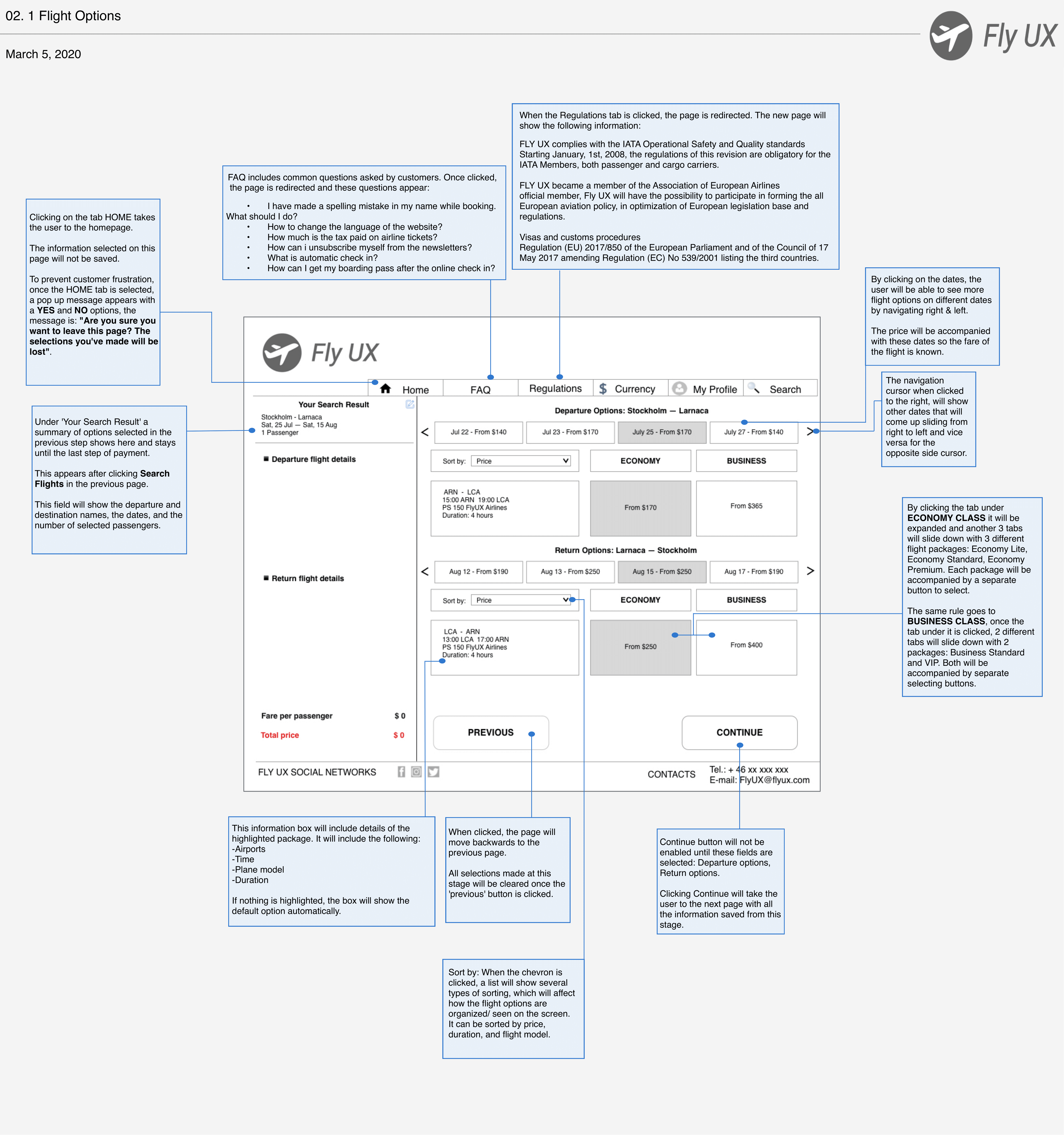
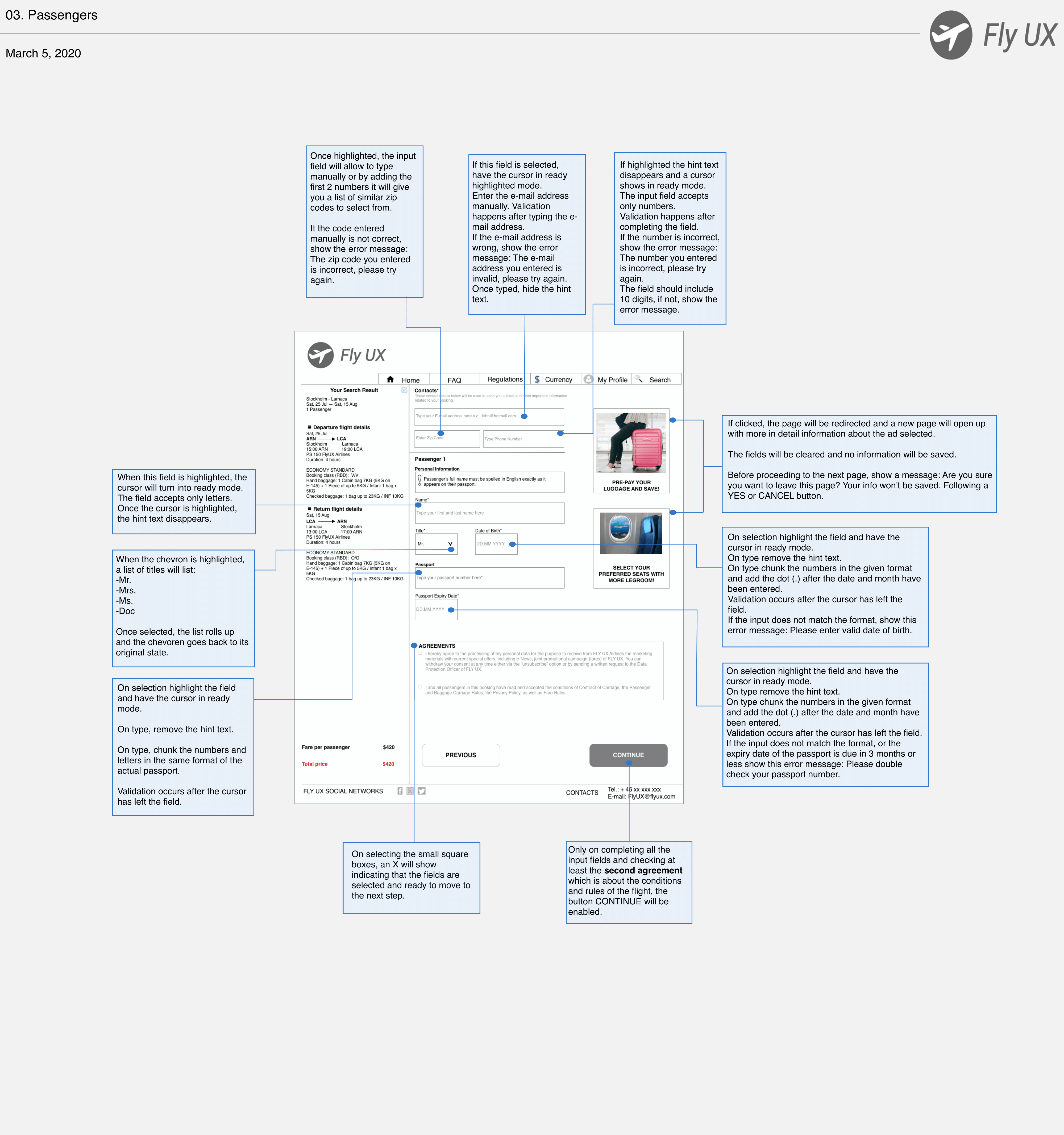
Wireframe
My work was almost done here, I just had one last thing to do and that was to create a set of wireframes containing all the necessary details such as feedback, rules and content a developer needs to build the website accurately. I spent long time on adding these annotations to make sure I covered everything to save the developer time and avoid miscommunication or other related problems.
Business Benefits
If designing FLY UX website was a success, it would be reflected in several areas that one could measure from:
- • Increase revenue
- • Reduce cost
- • Increase customer acquisition
- • Increase conversion
- • Increase customer satisfaction
- • Increase customer retention
- • Reduce customer churn